The Graphic Design of Future Transportation
4. Semester
Illustration, Editorial Design

There is no way around them: large-format surfaces on all kinds of transportation, whether it is buses, trucks or aircraft. Their design serves to convey information, but even though they take so much space in our everyday life they often leave us bored and uninspired.
As a designer you are confronted with the question: Couldn’t this surface have been designed in a more communicative or aesthetic way? The project „The graphic design of future transportation“ deals with exactly this question. We tried to find out what it would take to liberate our transportation routes of their visually bleak and uninspired appearance.
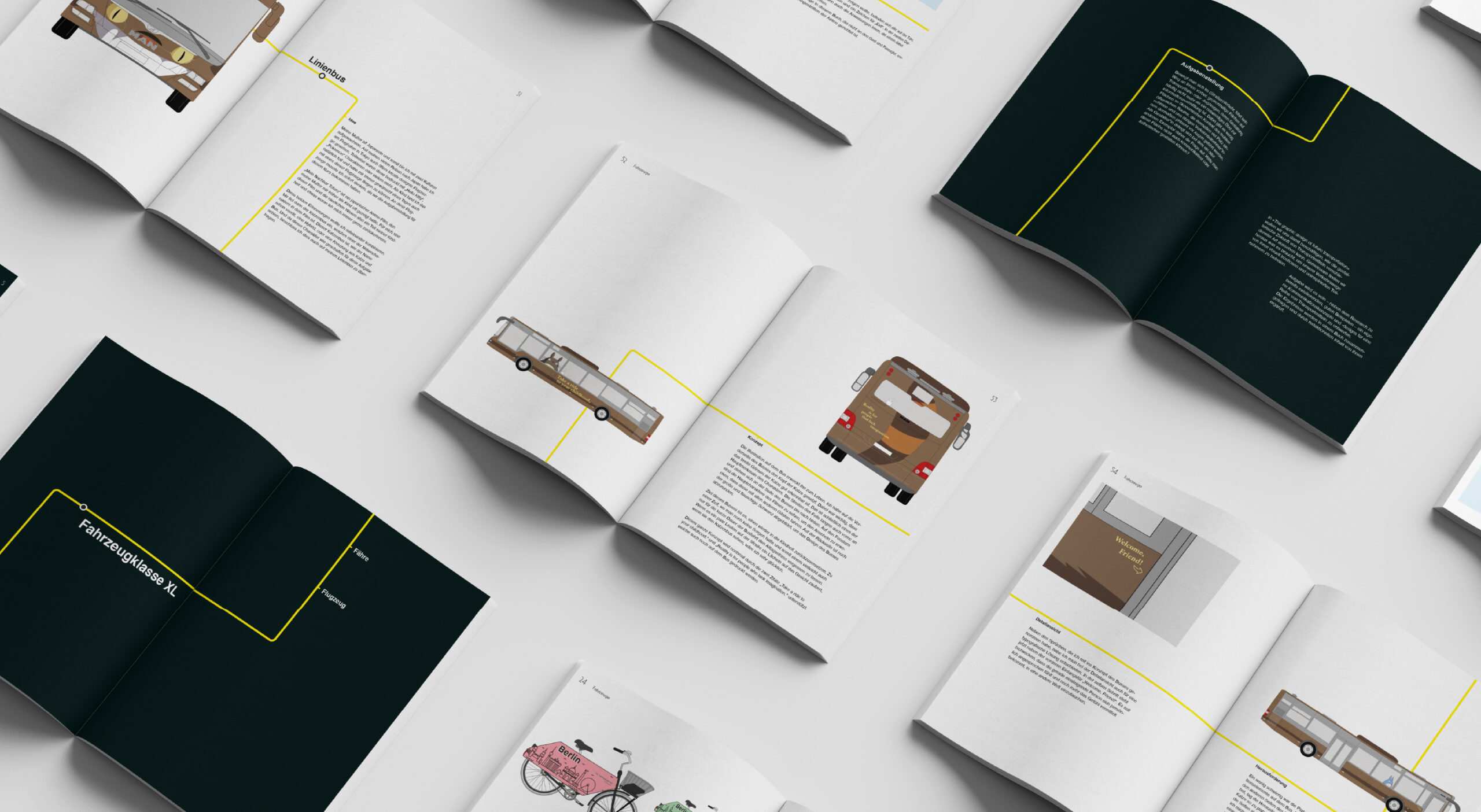
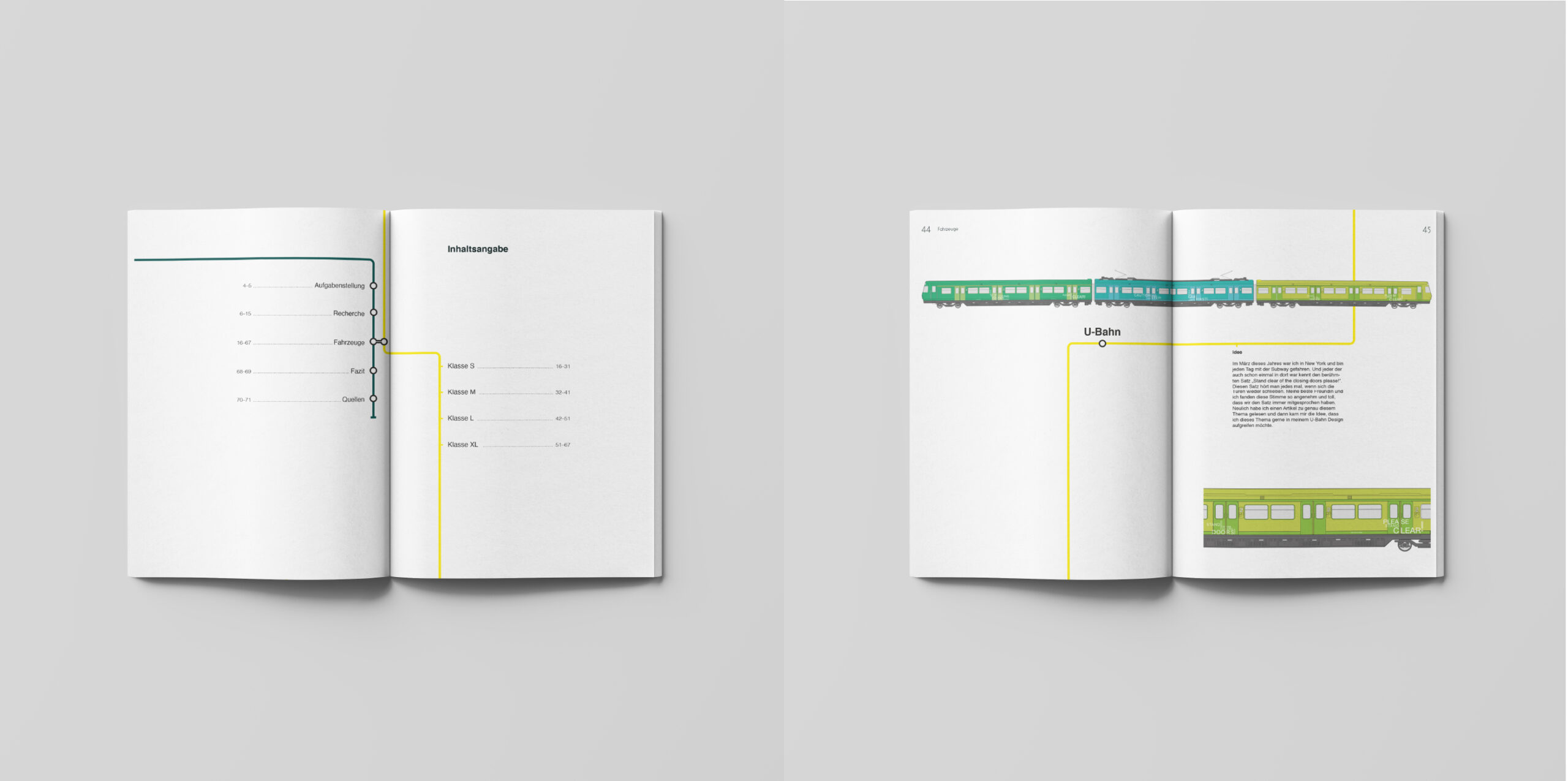
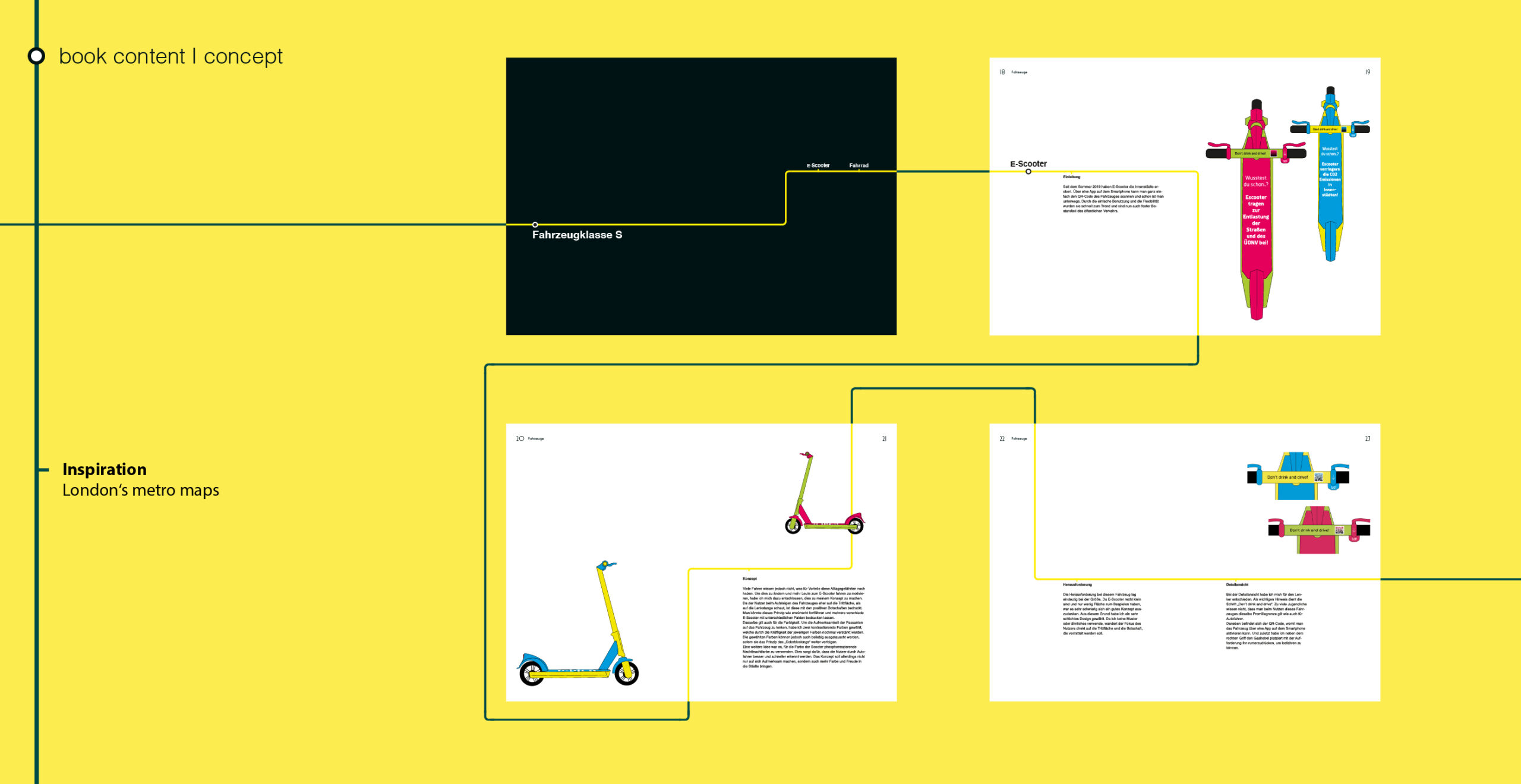
The final results were presented in a book.
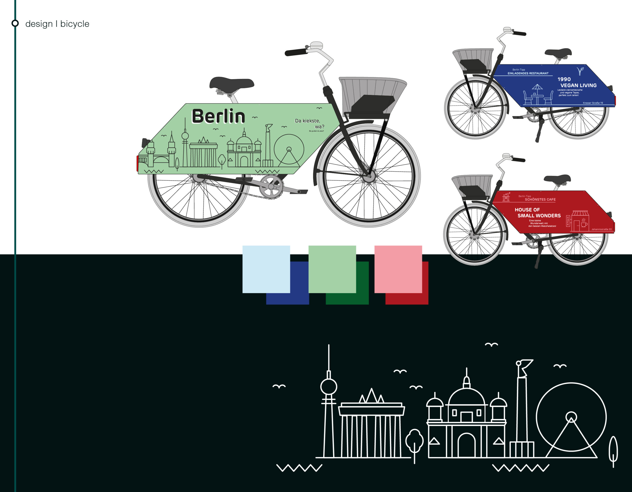
These bicycles are especially useful for tourists or first time visitors of cities. On the survace are illustrations and recommendations for things to do and places to visit. The recommendations are from the people living in the specific cities. For this example I chose Berlin and some of my favouite spots.
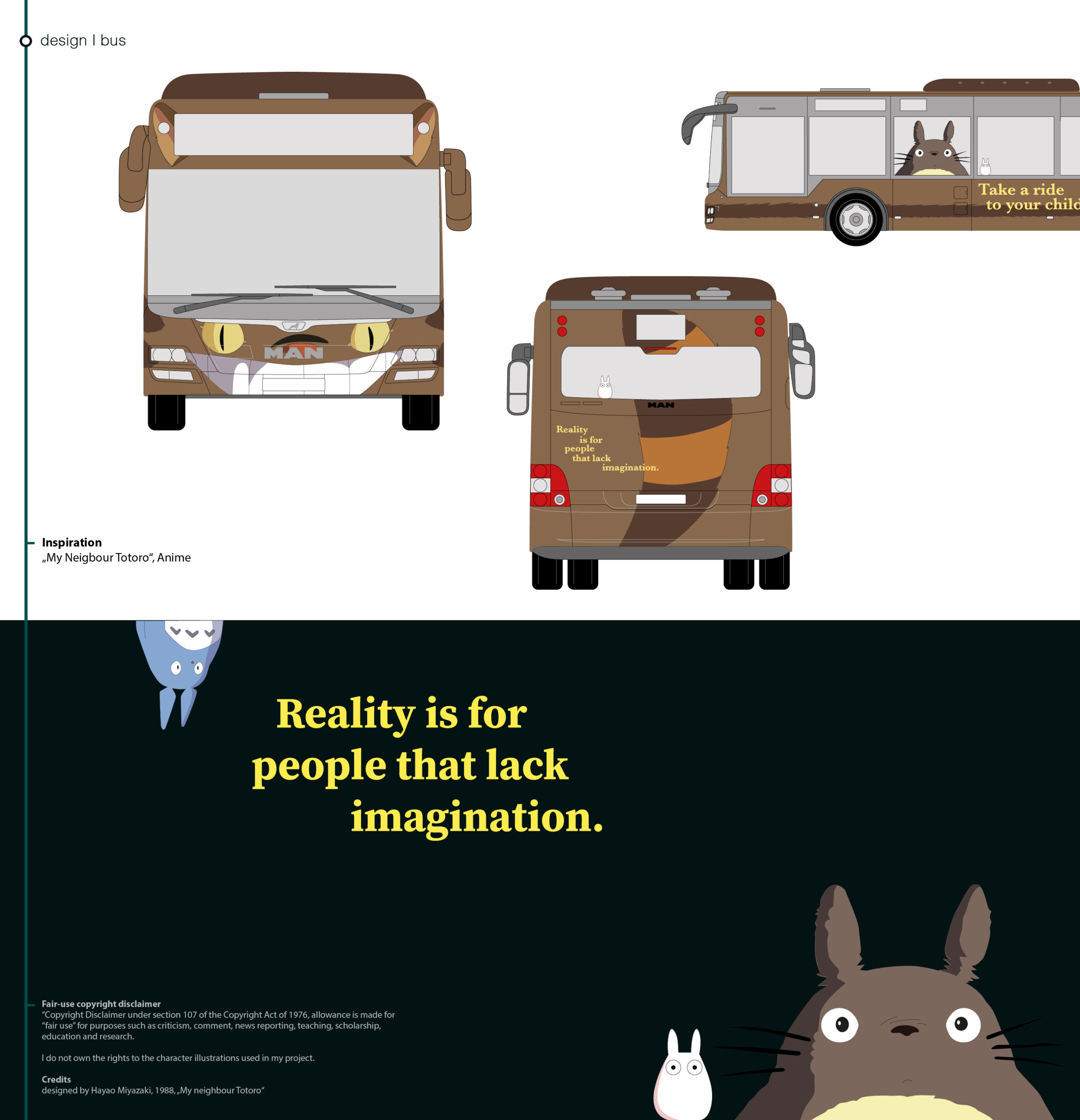
So my idea was to turn your average bus into the „Catbus“ character, to create a fun riding experience. Even more fun for all the „My Neigbour Totoro“ lovers. The „Catbus“ is paired with three different Totoro characters, visually sitting in the bus.
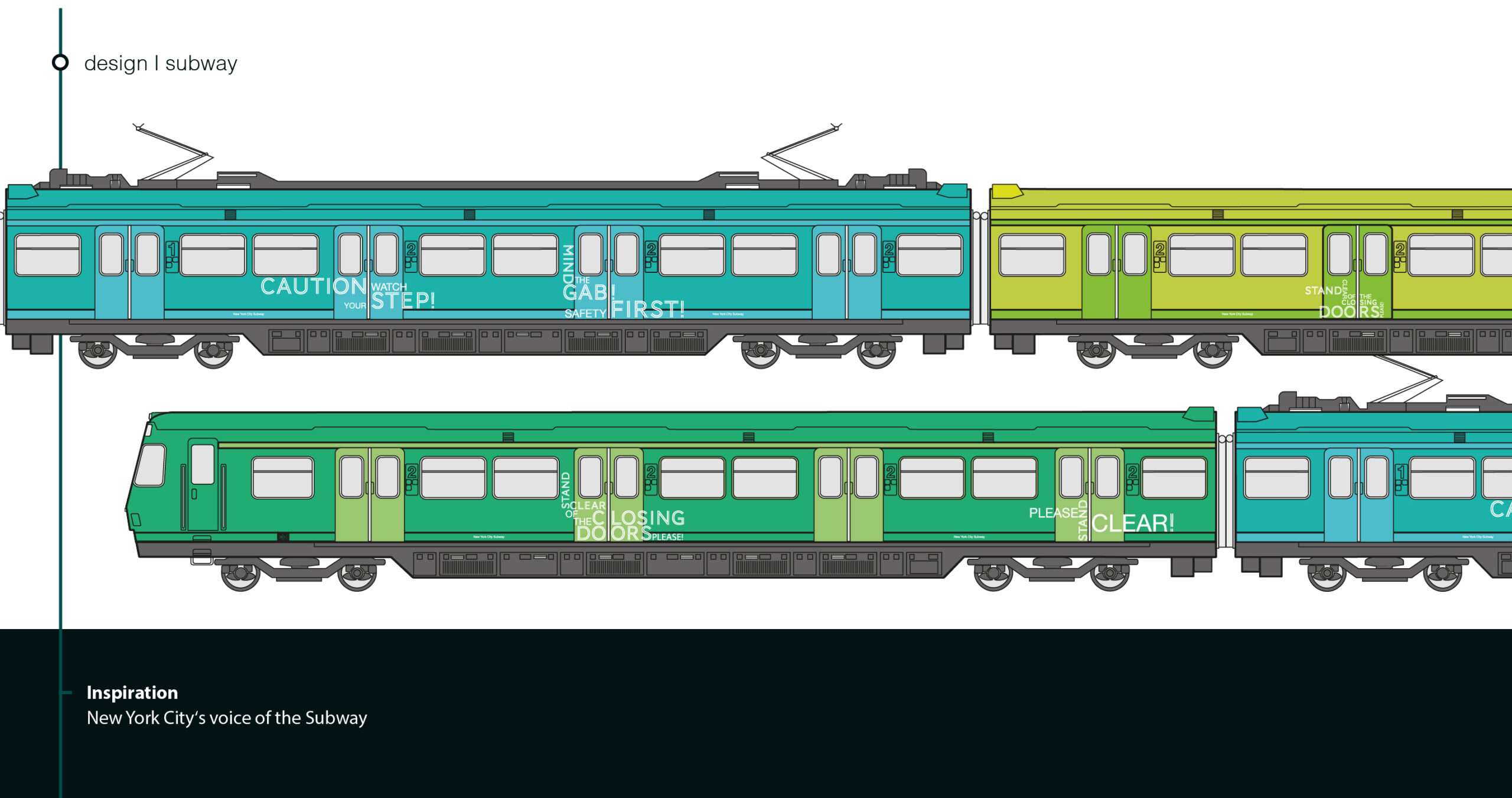
I decided to combine an important message with fun colored train wagons and an eyecatching font design. Everyone who has been to New York before will hear the very familiar deep voice who is saying „Stand clear of the closing doors, please!“
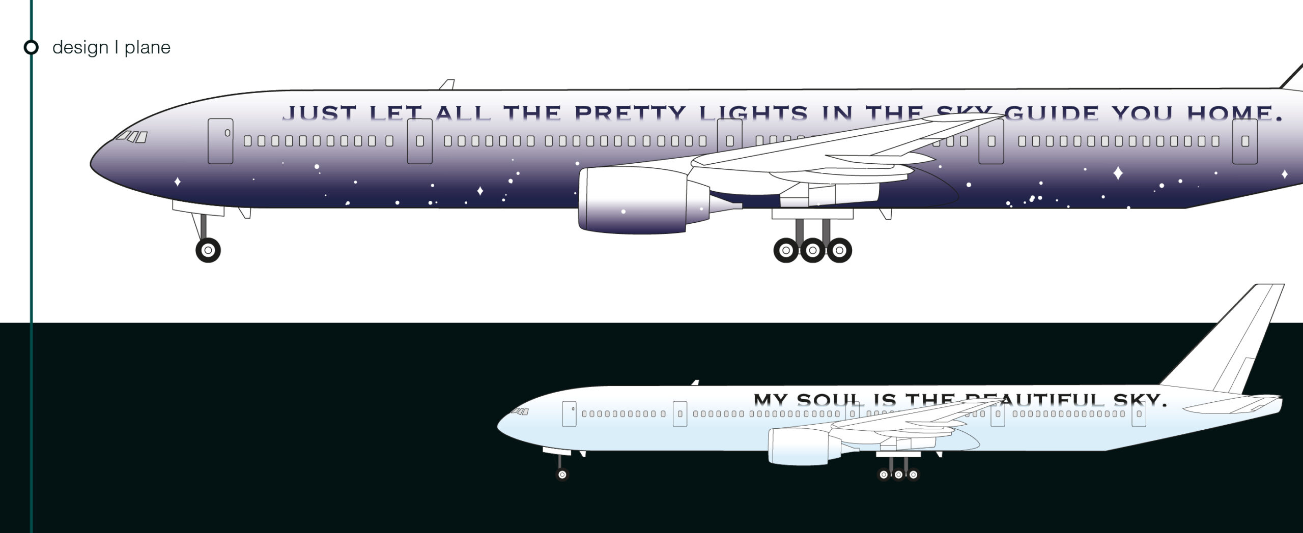
Planes are mostly seen from the bottom. These planes are designed to blend in beautifully with the sky. I created a day and night versions.

I thought about other ways boats are used and seen. So i designed this ship to look like a folded newspaper boat. Just imagine a little kid putting his small newspaper boat in the water and looking up, to see a giant versions of his!
