The idea and briefing itself is from the Instragram page @thebriefbabes.
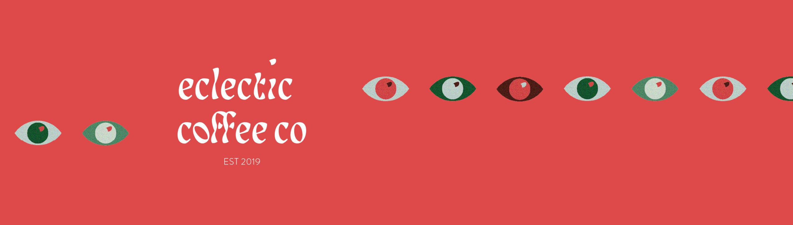
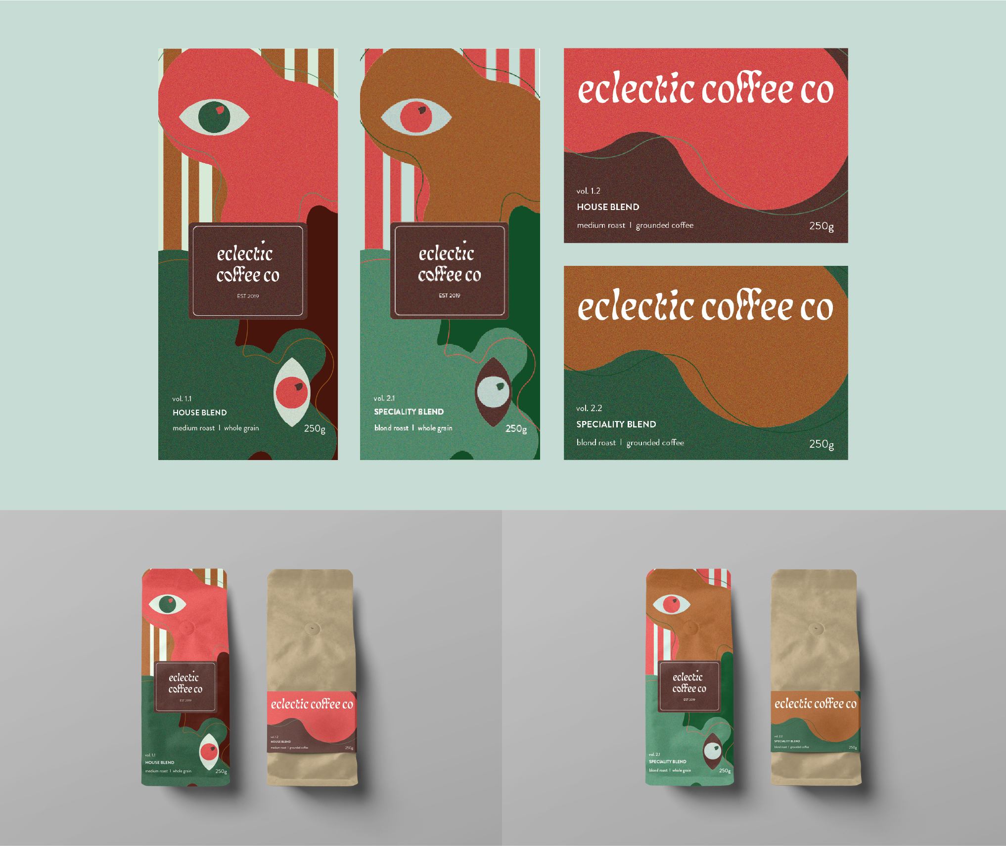
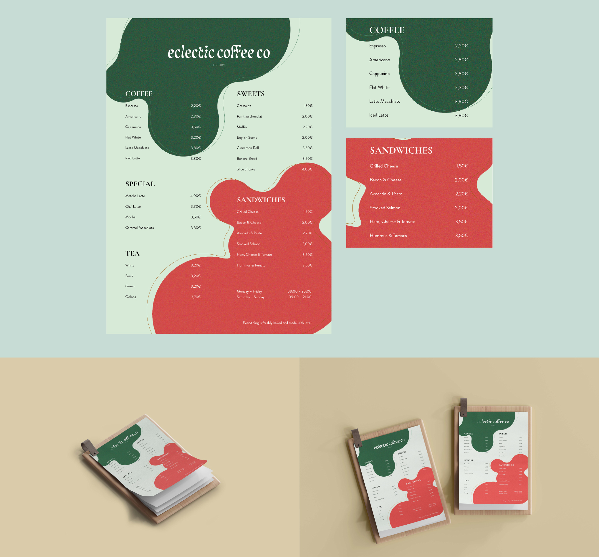
It is part of a weekly case study and the assignment was to create a full corporate design including a logo and packaging for a start-up coffee brand. The brand‘s name is “eclectic coffee co” and the appearence should be bold and fun, so it would stand out in the market.
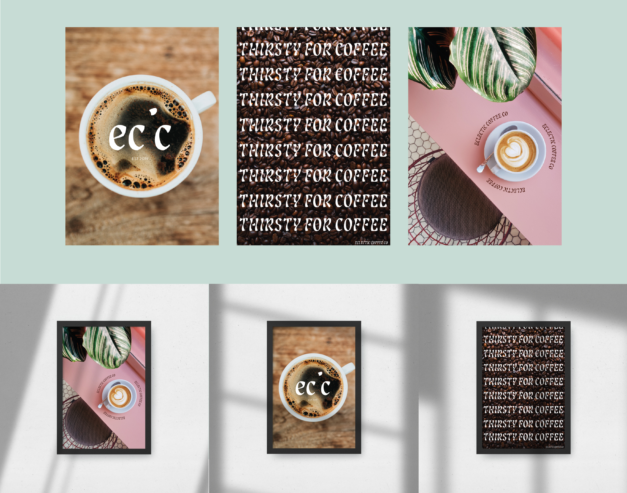
I decided to use a typography logo and chose “Lisbeth Display Regular” as my font, because of it‘s unique appearence. It‘s various stroke width paires well with the cheerful look of the brand.
The dot of the “i” is placed higher than the Cap Height tosymbolize the uplifting feeling you get after drinking coffee.The tilted “o” should remind of a coffee bean.
Logos has to be scalable and adaptable, so I created a shorter version of the original as well. This secondary logo is designed to be placed on small surfaces like stickers or business cards.
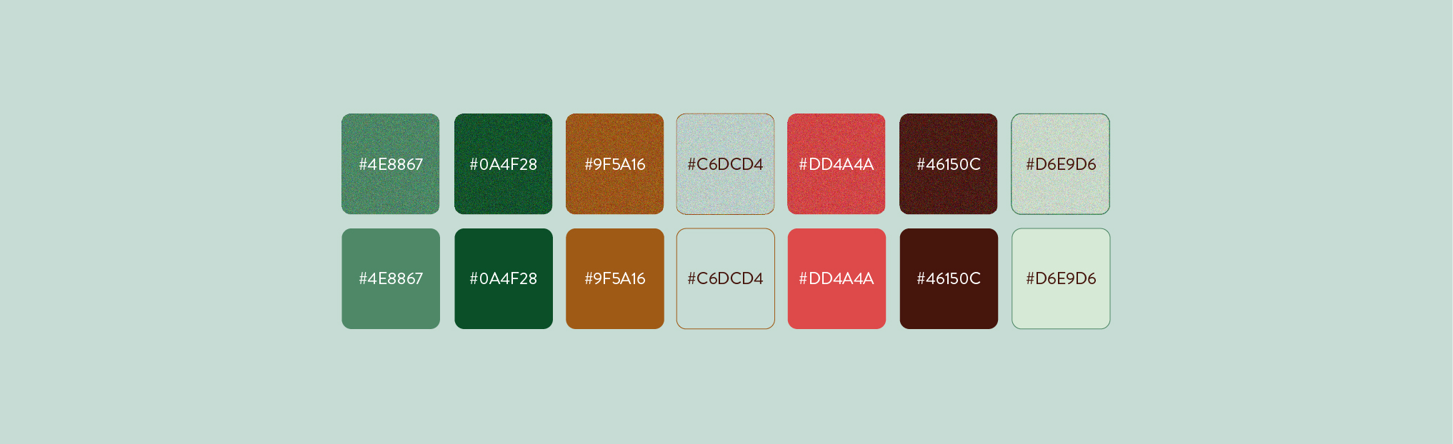
My colour palette consists of seven different colors, whichcan be used in a solid state and with a grainy texture.The contrast of color and texture is meant to be visuallyappealing and inviting, but also takes up the eclectic andbold theme the brand is running with.
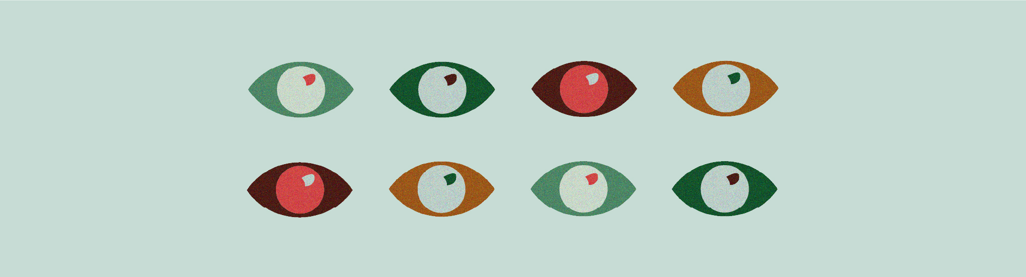
One of the recurring design elements is the eye. It underlines the main effect caffeine has, which is the release of dopamine, serotonin and adrenalin. The stimulating effect is displayed in a playful andcolourful way.